Case Study UX/UI

Nomad Camp
App

Simplifying the online shopping process

Tools Used
Figma
Pureref icon
Pureref
Pureref icon
Photoshop
Pureref icon

Project Overview

Product icon for case studies.

The Product

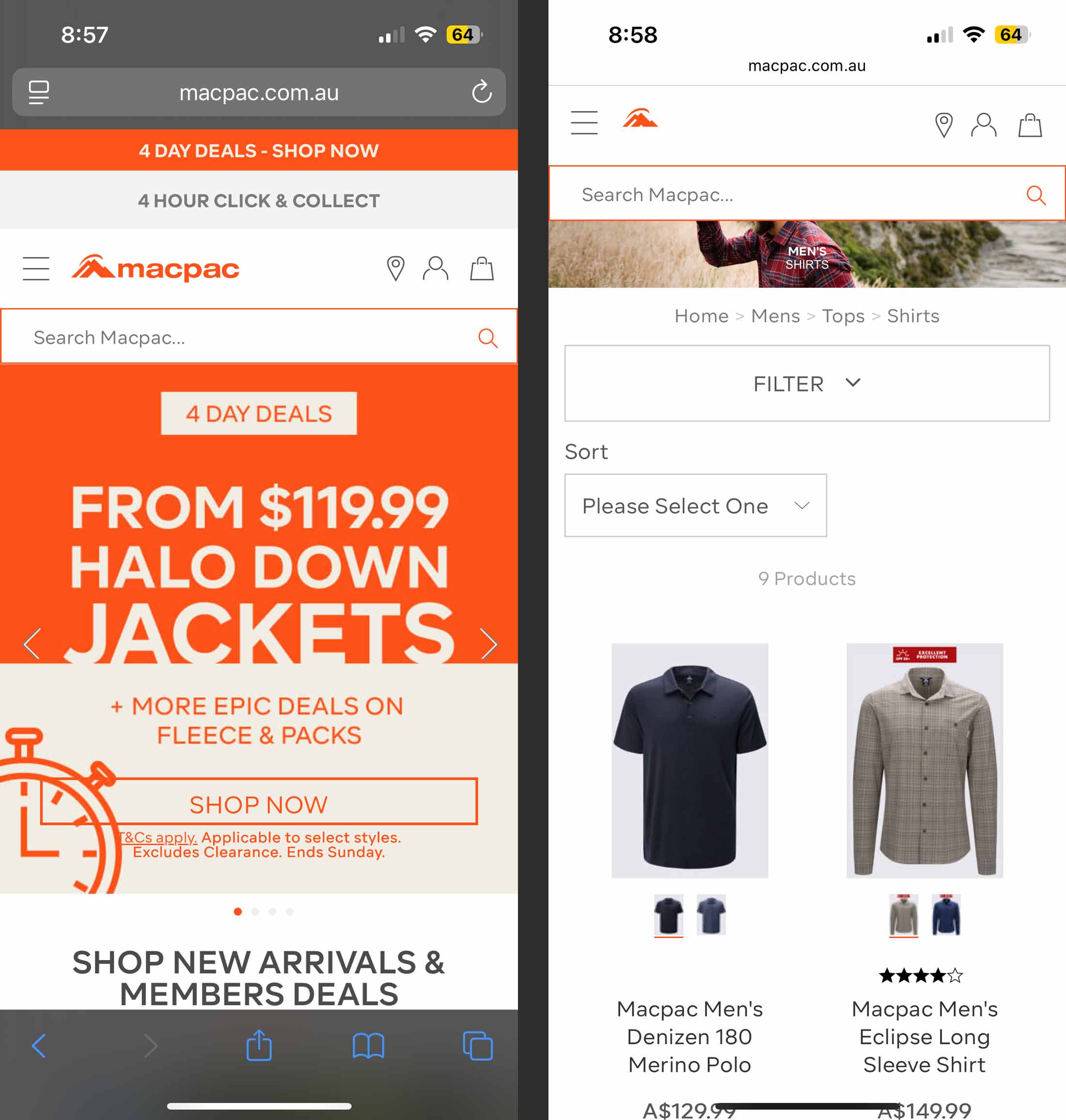
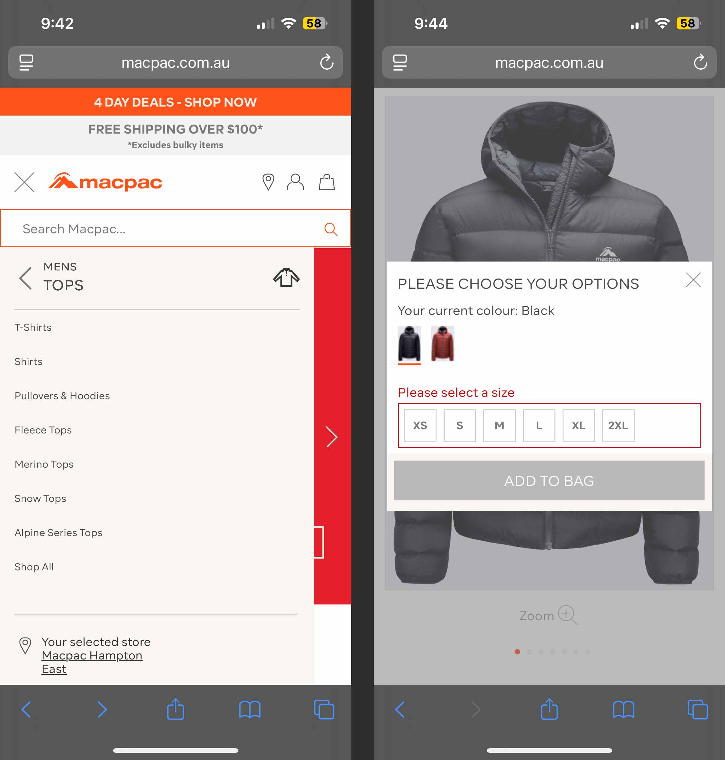
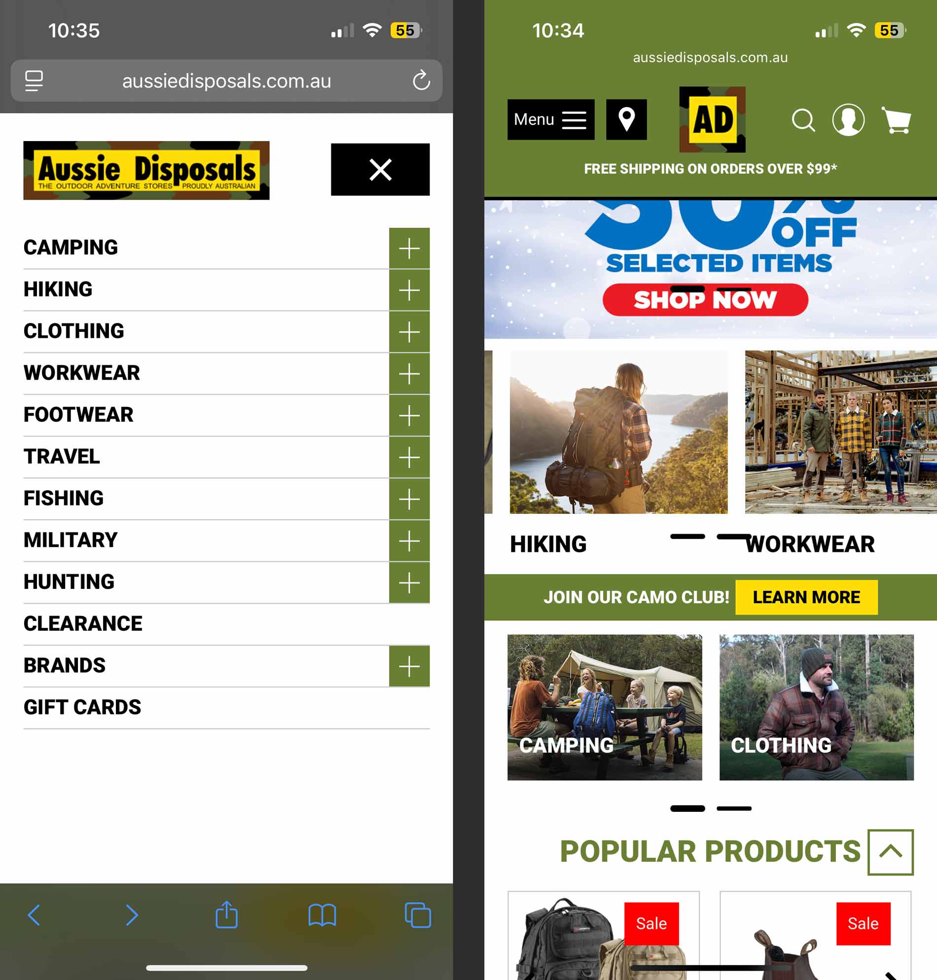
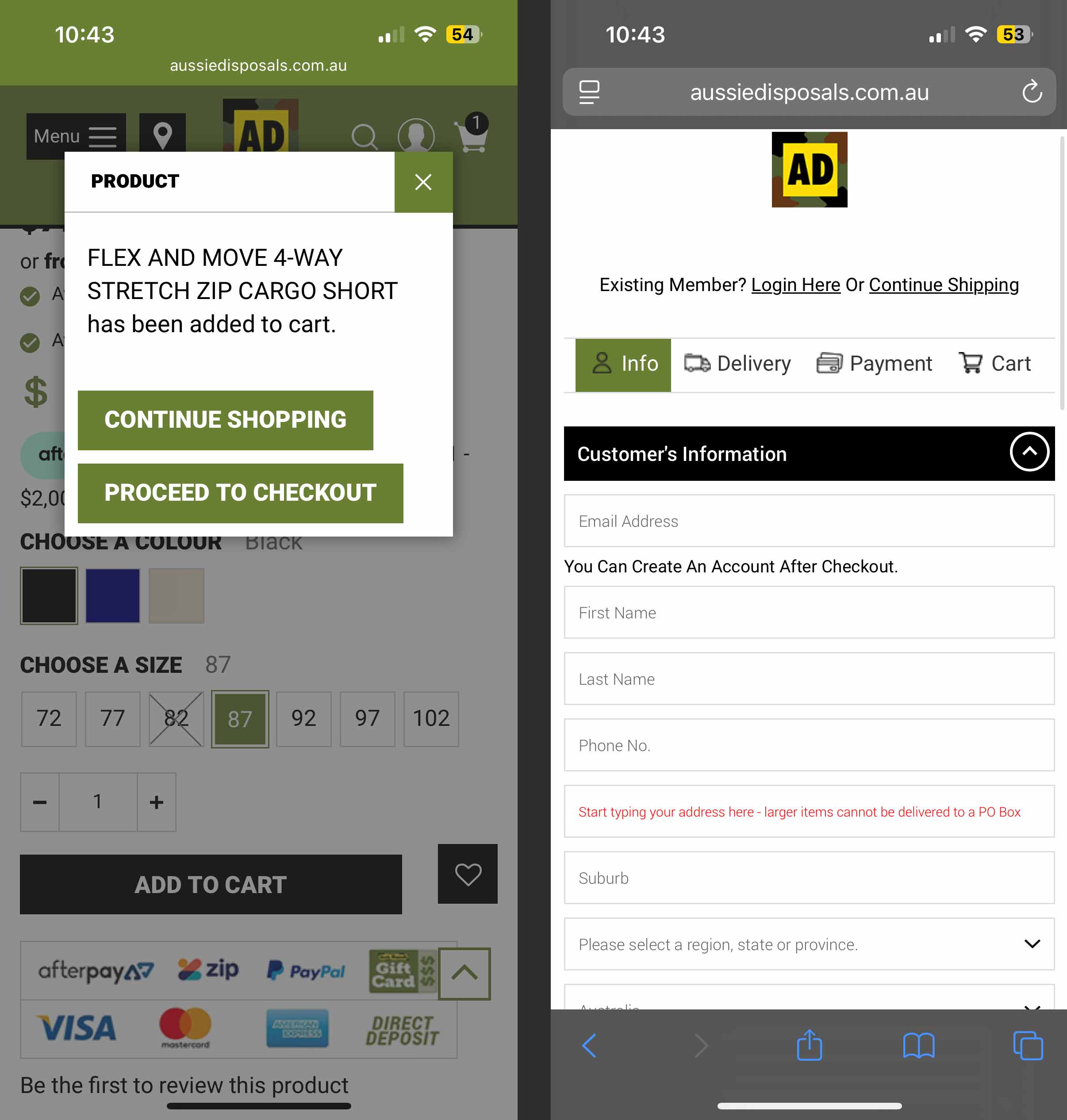
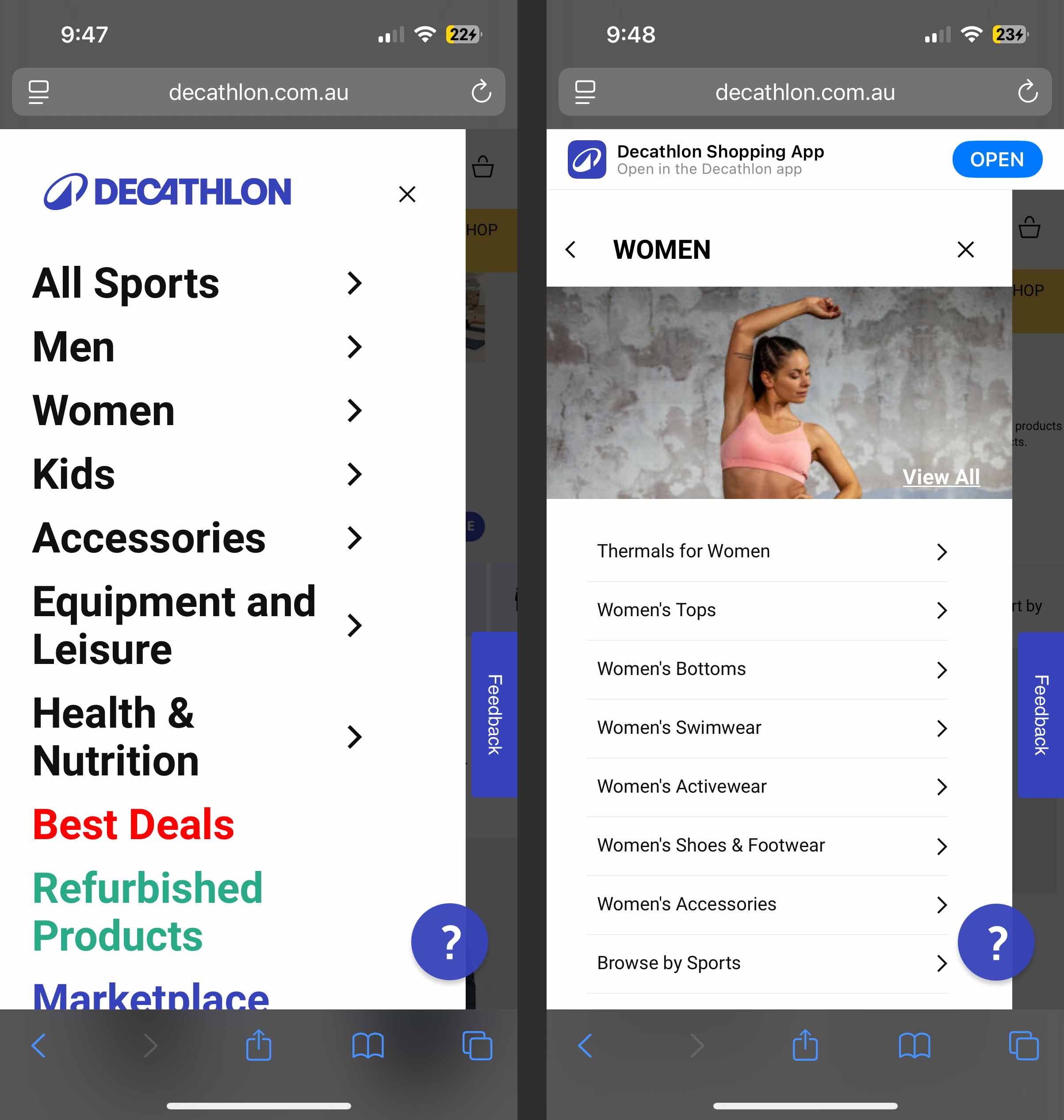
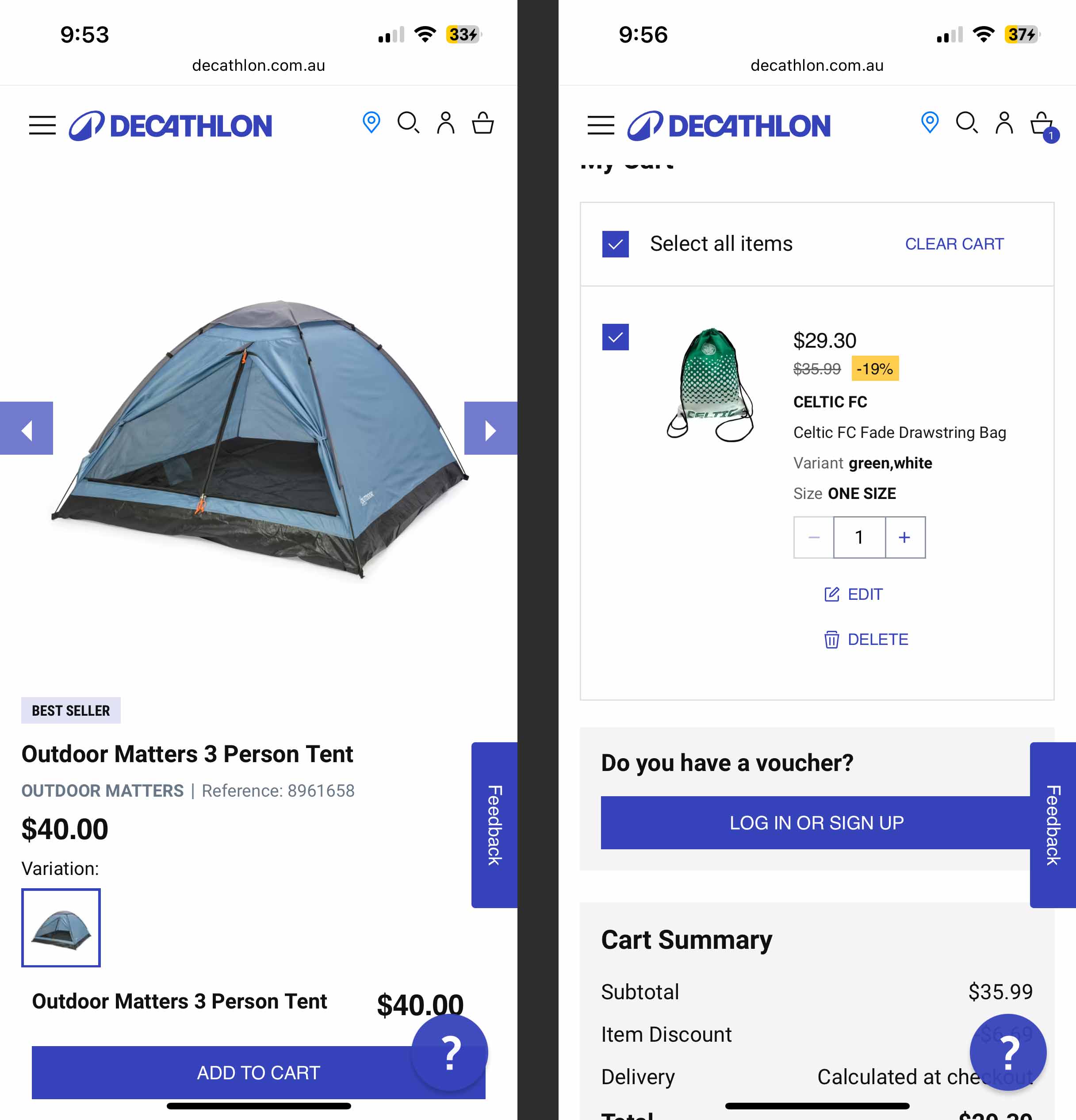
Nomad Camp is a retailer, with both an online store and physical locations across Australia, that caters to outdoor enthusiasts and weekend adventurers. The brand offers a wide range of products, including footwear, hiking and outdoor clothing, fishing equipment, and 4WD accessories. Because of the broad range of outdoor hobbies and products they sell, Nomad Camp appeals to a wide range of potential customers. The target demographic is individuals aged 17 to 75.

Pain point icon for case studies.

The Problem

People interested in outdoor goods come from various age groups, and the older group of users have limited experience with online shopping due to not growing up with e-commerce websites in their earlier years. As a result, this makes it difficult for older users to understand the shopping journey, the navigation and purchasing products with confidence online. A large percentage of campers in Australia are over the age of 50 or older being 46%.

Source: https://camperchamp.com.au/camping-statistics/

Target icon for case studies.

The Goal

The goal is to develop a camping application with a simple checkout process that enables users to easily browse and complete purchases, regardless of their age or online shopping experience, while minimising frustration.

Project Role

This project was an individual student endeavour. Following the design stages of the UX product lifecycle has enhanced my planning and research skills.

Visual Design & Prototyping
Empathy Mapping
Personas
Planning & User Research
User Flow Maps
Wire-framing

Competitor Audit

My competitor analysis of the camp supply industry included both direct and indirect competitors. The comparisons focused on consistency of design, accessibility, features, user flow, navigation, and clarity of information.

Macpac

Language - Outstanding

  • Descriptions are clear, concise and professional.
  • Product features are easy to read in bullet point format.

Features - Good

  • Has expected features for online shopping such as, quick view, store locator, filtering system, delivery option section and size guide.

Brand Identity - Oustanding

  • High quality images used throughout the website.
  • Consistent design style used throughout of brand.

Navigation - Good

  • Products are easy to navigate to with mobile website menu, with icons next to different type of products.
  • Typography is very small for page links which could be difficult for users with low vision to read.

User Flow - Good

  • Very easy to navigate site and find important functions with cart button fixed and navigation bar on mobile screen.
  • Progress bar during checkout makes it easy to understand what is to follow.

Accessibility - Good

  • Formfields are a good size being easy to select.
  • Text and links on menu meet a WCAG AA standard.

Anaconda

Language - Outstanding

  • Descriptions are clear and concise and professional.
  • Product features are easy to read in bullet point format.

Features - Good

  • Has expected features for online shopping such as, quick view, store locator, filtering system, delivery option section and size guide.

Brand Identity - Needs Work

  • Images aren’t optimised for mobile and are distorted. This doesn’t give the brand a consistent feeling from desktop to mobile.

Navigation - Good

  • Navigation easy to use on mobile with most popular links at the top of slide out menu.

User Flow - Good

  • On mobile buttons are positioned in an easy to find location to perform important tasks.

Accessibility - Needs Work

  • Doesn’t work with images using Apple’s inbuilt voice over tool on mobile website. Indicating that alt text hasn’t been used effectively.

Aussie Disposals

Language - Needs Work

  • Feels too text heavy in some sections of the website such as descriptions for product ranges in store.

Features - Good

  • Has suitable features for the online shopping experience such as, delivery availability, clear specifications, different methods of payment, and store locator.
  • For bulky items there is a note that delivery is not free. I think this is a good idea to remove the chances of frustration when entering checkout stage for users.

Brand Identity - Needs Work

  • Too many colours used throughout the website which does not give a consistent brand look.

Navigation - Needs Work

  • The navigation feels like it needs work on the mobile website including the information architecture. A whole product range can’t be viewed at once, only subcategories individually. Also, subcategories are not included in the navigation menu which makes it feel inefficient from a usability perspective.  

User Flow - Good

  • Easy to follow user flow for purchasing a product and adding to cart, with important buttons high up the page order.
  • Progress bar indicates steps effectively of checkout process with current step highlighted.

Accessibility - Needs Work

  • Form fields could be made larger for users with large fingers, also field placeholder text is too small for users with low vision.
  • To emphasise delivery note, maybe would work better with an icon next to it. Text is also too small.
  • “start typing address here” is also too complex as placeholder copy for form field. This would work better as an error message that could appear below field if someone entered PO box.
  • Form fields don't have labels which could make the task more difficult for users filling in with disabilities and operating screen readers.

Decathlon

Language - Good

  • Clear and concise information on product overview information.

Features - Good

  • Has a variety of features from FAQ button for easy access, store locator, filtering system, sign-in methods, size guide and reviews.

Brand Identity - Good

  • High quality imagery used across website.
  • Consistent colour usage across website elements, including call to action, stock levels, and discounts.

Navigation - Good

  • Navigation is easy to use with logical information architecture. 
  • Includes an image for product categories which allows the user to understand which category they have selected. However, images in the navigation section haven’t been optimised for mobile screen size.

User Flow - Oustanding

  • Easy to find buttons with navigation and add to cart button in a fixed position.
  • Effective use of colours making it easy to find options, buttons and interactive elements on page.
  • Clear instructions for checkout process with numbering order system.

Accessibility - Good

  • iPhone device voiceover assistant works well with cart information in logical order for reader.

Empathy Map

Aggregated empathy map from user group interviews. Collecting information from different potential users based on thoughts, feelings and behaviours.

User Research Summary

Initial research on potential users and customers was conducted through in-person interviews and phone calls, based on availability and preference. Before these interviews, I believed that the layout of products in outdoor stores was easy to follow. However, both the competitor audit and user research revealed accessibility issues, including problems with screen reader compatibility, which changed my perspective.

Pain point icon for case studies.
Pain Point

Products taking longer than expected to be delivered.

Pain point icon for case studies.
Pain Point

Forms that aren’t clear to fill out.

Pain point icon for case studies.
Pain Point

Being overwhelmed by the amount of products displayed on screen.

Pain point icon for case studies.
Pain Point

Certain products not displaying enough information or easy to understand.

Personas

Charlotte Smith persona.John Brown persona.Persona image of Greg Townshend for Nomad Camp app.

User Flow Map

Nomad Camp app user flow.

Site Map

Nomad Camp app site map.

Wireframes

Lo-Fi Wireframe: Home screen, log in screen, navigation bar variations, & tab bar
Lo-Fi Wireframe: Product screen & cart screen
Lo-Fi Wireframe: Address screen delivery screen & payment screen

Digital Wireframes

Usability Study Findings

Findings
  • User found Our Products section useful for quick searching.
  • Users want an easier way to set an address and delivery type.
  • Users require forms with surrounding elements that don’t confuse.
Findings
  • Improvements required to checkout delivery section. Unnecessary information is displayed in Click & Collect.
  • Users would be able to reach important product information faster and more easily if higher up on page.

Low Fidelity Prototype

Mockups

Low fidelity screen of delivery screen before usability test.

Before Usability Study

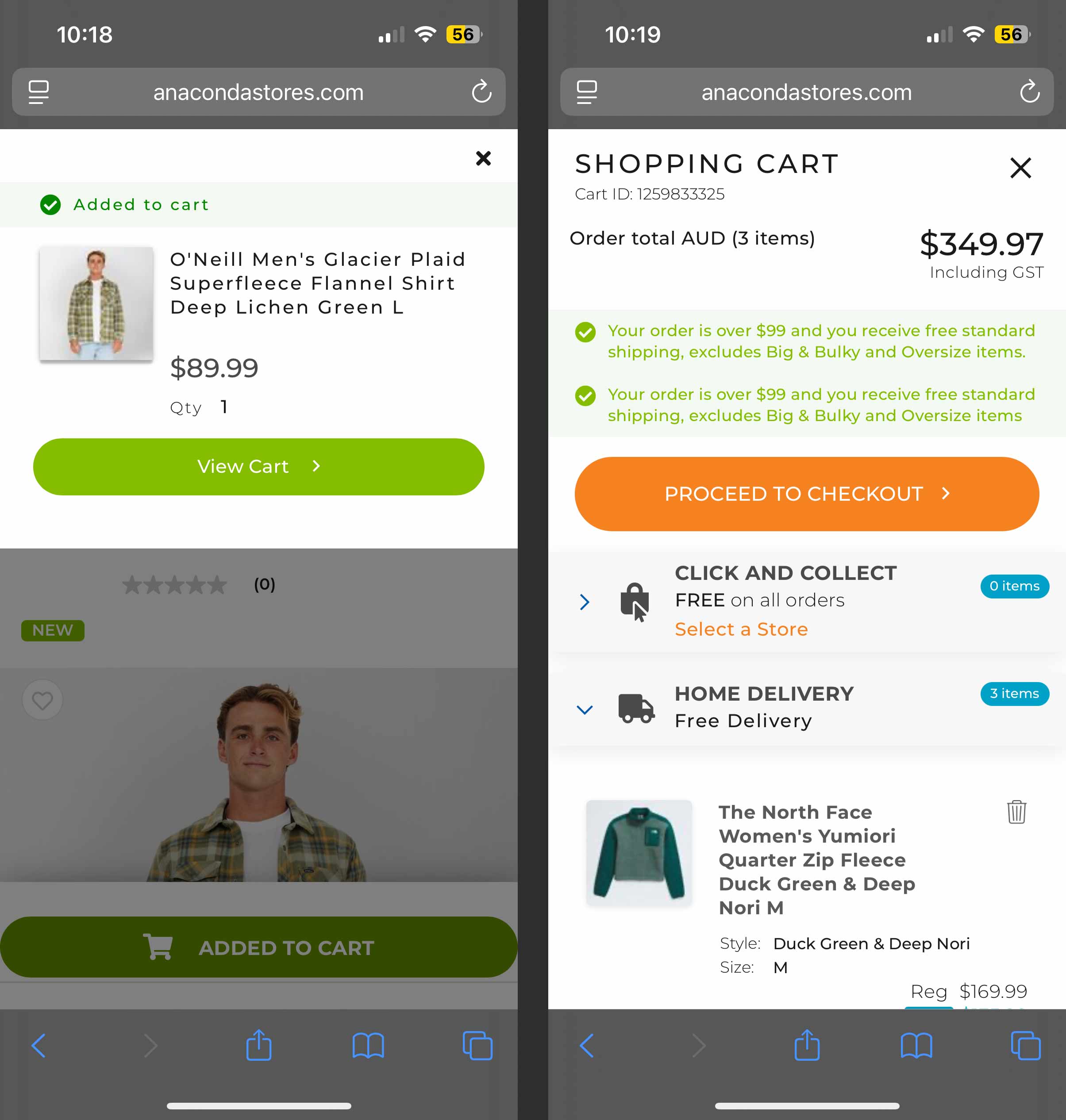
The address selection section was designed to use a numbered system, intending to guide users through the necessary steps in order. The idea was that users would first select their address (step one) and then choose their preferred delivery type (step two). However, a usability study revealed that this design was ineffective. Participants did not notice or follow the numbered order or the title indicating the sequence of actions.

Low fidelity screen of delivery screen after usability test.

After Usability Study

Based on user behaviour observed in the initial usability test, I decided to reduce the number of actions required to be taken while selecting an address. I separated delivery address from delivery type to a separate screen.

Low fidelity payment screen before usability test.

Before Usability Study

During the first usability study, a participant highlighted the card payment form was missing billing address field. This feedback underscored the importance of including the billing address as a vital security feature to help prevent unauthorised purchases.

Low fidelity screen of payment after usability study.

After Usability Study

High Fidelity Mockups

High fidelity mockup of app main screen and product range screen. High fidelity mockup of tent overview screen and men's jacket screen. High fidelity mockup of my cart screen and delivery address screen.. High fidelity mockup of delivery options and click & collect.High fidelity mockup of delivery address and payment method. High fidelity mockup of credit card payment and order confirmation.

Accessibility Considerations

Tick icon for case studies.
Accessibility

UI components were checked using WCAG that colours meet AA Compliance.

Tick icon for case studies.
Accessibility

Easy to read typeface has been selected with a clean and simple design in different weights. The type hierarchy scale system allows the user to decipher different sections.

Tick icon for case studies.
Accessibility

Labels under icons for screen readers and to allow users to easily understand navigation bar links.

High Fidelity Prototype

Takeaways

Impact

In areal-world scenario, to gauge the effectiveness of these UX design developments, I would use to measure the impact on users from signups, customer feedback surveys and sales statistics completed through app.

Woman running across river.
Clothing on shop wall.
What I Learnt

Since this was my first major project in Figma, I learnt the power of components and keeping them organised. Areas of improvements that I would like to further study consist of, better name conventions of styles and improving UX research skills.

Man hiking to mountain top.

Next Steps

Obtain further feedback from industry professionals in UX/UI or design.

Potentially to make revisions to the design from
e-commerce app research in the future.

Personal signature with contact details.