Finance Pal logo

Case Study UX/UI

Finance Pal

Centralising invoicing and time keeping

Tools Used
Figma
Pureref icon
Pureref
Pureref icon
Photoshop
Pureref icon

Project Overview

Product icon for case studies.

The Product

Finance Pal is an online platform designed for freelancers and small business owners. It enables users to track time spent on client work and record this data for several key purposes: billing clients accurately, monitoring company revenue, and providing a clear overview of outstanding invoices.

Pain point icon for case studies.

The Problem

Small businesses and freelancers often use dated and inefficient methods for collecting time records and projects descriptions for invoicing clients. Some of these methods could be using an excel spreadsheet or pen and paper.

There are a several issues this can cause because of using outdated methods. The are, inaccurate project descriptions with not enough precision depending on the nature of work, guessing of hours spent on work that could result in overcharging clients effecting business relationships, work time wasted trying to find data, and manually entering data into a spreadsheet.  

Target icon for case studies.

The Goal

Providing for small businesses and freelance professionals an accessible invoice management website product that can be used easily throughout the workday on different devices. Reducing time spent on recording time entries for client work, additional project expenses and reducing time wasted on errors being made on billing companies with lost and inaccurate information.

Finance Pal log in screen image to website with mobile being held.

Project Role

This project was an individual student endeavour. Following the design stages of the UX product lifecycle has enhanced my planning and research skills.

Visual Design & Prototyping
Empathy Mapping
Personas
Planning & User Research
User Flow Maps
Wire-framing

Competitor Audit

Areas For Improvement

Fresh Books

Language - Needs Work

  • Descriptions feel too wordy in some sections on website.
  • Titles too long in length.

Brand Identity - Needs Work

  • Doesn’t have a clear branding direction. As it feels like there are too many design styles with typography, colour and illustrations.
  • Freshbook main branding colour feels too similar to Xero.

User Flow - Needs Work

  • User flow works but feels like it could be more efficient as some highly important UI components require a click path to another window when they should be visible on screen.

Areas For Improvement

Toggl Tack

Navigation - Needs Work

  • The vertical navigation bar is organised into categories with subheadings. However, this navigation features many visible links which may increase efforts for users to make a decision. Maybe the less important pages could be placed into a hamburger menu.
Image of Freshbooks dashboard.
Close up of Freshbooks dashboard and placeholder.
Toggl Track navigation close up and UI buttons.

Areas For Improvement

Harvest

Accessibility - Okay

  • Screen reader extension works well with website.
  • No Alt text information for images on website. So, screen readers can’t describe illustrations.

Brand Identity - Needs Work

  • I believe there is room for improvement for the branding as there is no unique standout branding element. This could be achieved with a more recognisable illustration style, modernised UI, exploration of animation and interaction design.
Harvest timer and illustration with text.
Freshbooks closeup of window with fields.

Areas Performing Highly

Toggl Track

Language - Good

  • Language of how to achieve the basic tasks is clear and simple

Features - Good

  • Has the appropriate features included for user requirements for invoicing and time keeping.
  • Doesn’t feel like it has overcomplicated functionality.

Brand Identity - Outstanding

  • Consistent colour theme throughout website and on illustration.
  • Has simple branding to maximise screen space for elements.
  • Colour palette stands out from other products researched with a unique look.

User Flow - Outstanding

  • User flow is intuitive as doesn’t require much learning.
  • Buttons are in easy to find locations for filtering and creating invoices in a similar section.
Toggl Track illustrations of invoice process.Toggl Track time entries UI.

Areas Performing Highly

Xero

Language - Good

  • Paragraph descriptions for sections are a suitable length and not too wordy.

Features - Outstanding

  • Xero has an extensive number of features. They are categorised logically placement under their main category link.

Brand Identity - Good

  • Has a good use of illustration to convey a message with consist of colour palette.
  • Maybe a pictogram logo could be used for more brand presence as there is no logo included within the website.

User Flow - Good

  • The flow is efficient with logical ordering of UI components.
  • Information fields are featured in a logical order.

Navigation - Outstanding

  • Iconography is effectively used in the navigation bar to show links for additional features.

Areas Performing Highly

Harvest

Language - Good

  • Descriptions for links and sections are clear and easy to understand with simple concise copy used.

User Flow - Good

  • Button placement to page main functions and options are in a consistent area making them easy to find.

Navigation - Outstanding

  • Is effective with not too many main categories in the navigation bar.
  • Links to subpages are revealed underneath navigation section making them easy to find with consistent placement.

Areas Performing Highly

Fresh Books

Language - Good

  • Has all the needed functionality for invoicing and time keeping.
Xero dashboard with menu dropdown showing.
Welcome page of Harvest.

Empathy Mapping

Finance Pal empathy map from interview participant.

User Research Summary

To better understand different user types, I conducted foundational user interviews with a set of targeted questions. The goal was to identify the frustrations and requirements of employees and freelance creatives. Qualitative research was chosen as it was the most effective method for a small research group.

Pain point icon for case studies.
Pain Point

Personal information being stored by website from using previous invoicing platforms.

Pain point icon for case studies.
Pain Point

During busy periods struggling to keep up with invoicing clients.

Pain point icon for case studies.
Pain Point

If invoices aren’t paid on time.

Pain point icon for case studies.
Pain Point

Descriptions on invoices being incomplete and hard to understand during tax claims.

Personas

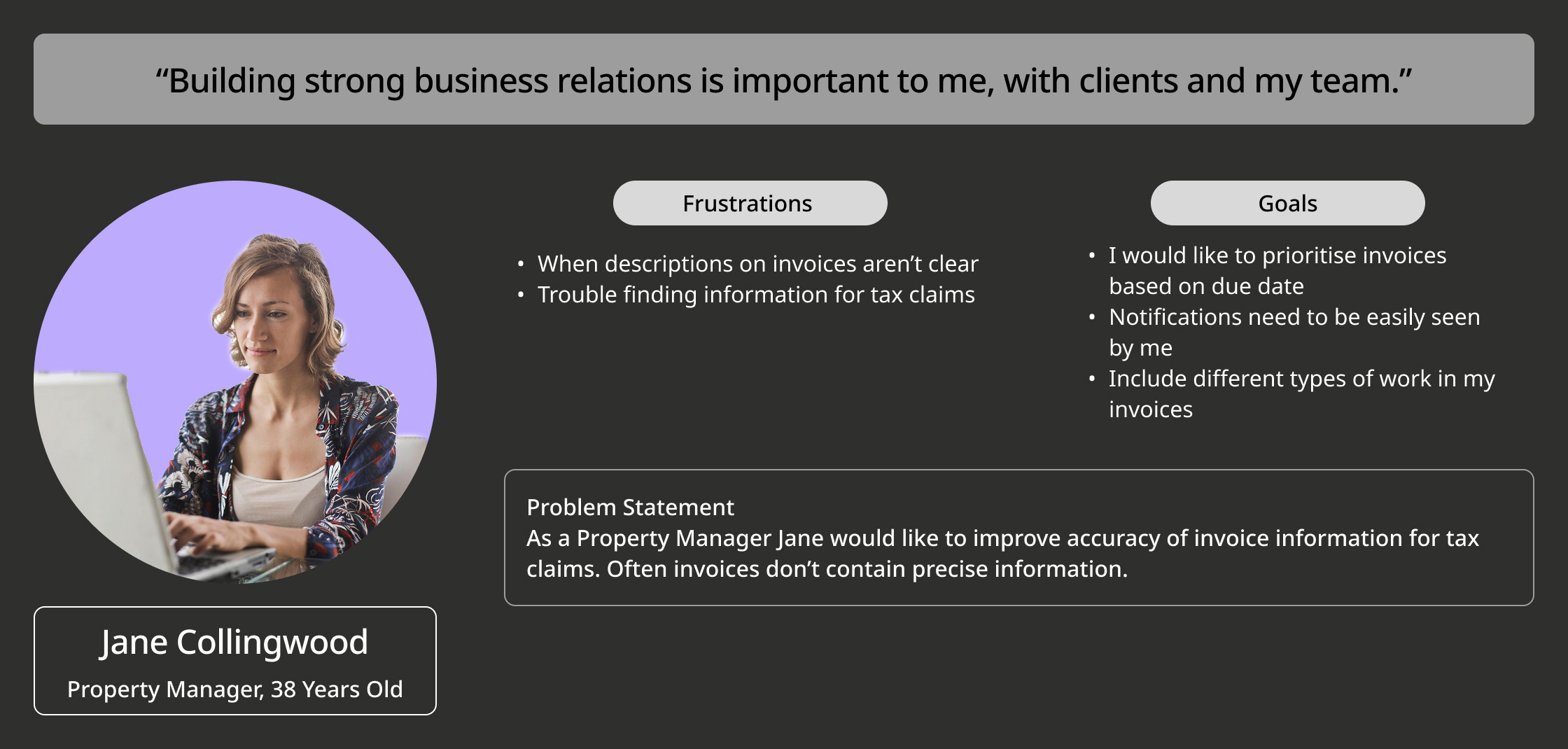
Finance Pal persona of Andre Alonso with goals.Finance Pal persona of Jane Collingwood with goals.Finance Pal persona of Lauren Collier with goals.Finance Pal persona of Nick Patel with goals.

User Journey Map

User journey map of Andre Alonso.

Site Map

This is a basic overview of Finance Pal website sitemap with consideration of other pages. The priority for this project has been the main user flow of recording data and generating invoice for client payments.

Site map image for Finance Pal website case study.

Wireframes

After initially creating wireframes, I began the process of adding more detail and consideration to user flow and requirements. Effort was made in keeping the design and UI as simple as possible as this website is for small sized companies. I would like to remove the guess work with an intuitive information architecture that does not require a large amount of learning.

Finance Pal digital wireframes.

Usability Study Findings

Finding
  • Breaking down information into quarters for dashboard is a clear way to indicate what time of the year data is from.
  • Confusion with list of links on mobile slide out menu and relevance of functions.
Finding
  • Adding an activity log section on dashboard could be a good way to keep users informed about recent activity.
  • Invoice sent page needs more information. So when multiple invoices are sent throughout the day, they easier for users to identify.

Low-fidelity Prototype

Library icons for Finance Pal case study.Image of Finance Pal UI kit featuring buttons, UI components and colours used.

Mockups

Mockup of dashboard before usability study.

Before Usability Study

During the first round of interviews, I learnt I should have provided more information to participants of what to expect in a low fidelity design usability testing. Initially, I was focused more on the layout and information architecture. During the early stage of testing, I was advised of a better way in labelling dashboard sections with a more logical approach so users would immediately understand what they were viewing.

Mockup of dashboard after usability study.

After Usability Study

Finance Pal menu design before user study.

Before Usability Study

The initial slide-out menu grouped all links together without any categorisation, making it difficult for users to quickly scan and find what they needed. Observing the confusion and the time users spent deciphering the menu during the usability test, I revised the design to include clear categorisation of the links, improving scannability and ease of navigation.

Finance Pal menu design after user study.

After Usability Study

Mockup of invoice sent before usability study.

Before Usability Study

Mockup of invoice sent after usability study.

After Usability Study

High Fidelity Mockups

High infidelity mockup of dashboard for desktop and mobile. High infidelity mockup of dashboard for desktop and mobile. High infidelity mockup of reports for desktop and mobile. High infidelity mockup of filter menu for desktop and mobile. High infidelity mockup of all invoices for desktop and mobile. High infidelity mockup of create invoice for desktop and mobile. High infidelity mockup of confirm invoice for desktop and mobile. High infidelity mockup of invoice sent for desktop and mobile.

Accessibility Considerations

Tick icon for case studies.
Accessibility

UI components were checked using WCAG that colours meet AA Compliance.

Tick icon for case studies.
Accessibility

Easy to read typeface has been selected with a clean and simple design in different weights. The type hierarchy scale system allows the user to decipher different sections.

Tick icon for case studies.
Accessibility

Labels under icons for screen readers and to allow users to easily understand navigation bar links.

High Fidelity Prototype

Takeaways

What I Learnt

Throughout the Finance Pal design process, the usability studies proved invaluable in shaping the various stages of the user flow. The feedback gathered significantly contributed to simplifying the information presented and eliminating ambiguity, especially on the dashboard.

Man using laptop and smiling in office.
Finance Pal black shirt design.
Finance Pal bag design.
Finance Pal mugs mockup with brand colours.

Next Steps

Obtain further feedback from industry professionals in UX/UI or design. Potentially also from the usability testing group that is likely to use Finance Pal.

Trialling receiving feedback from social networks on my UX/UI design work.

Personal project signature with contact details.